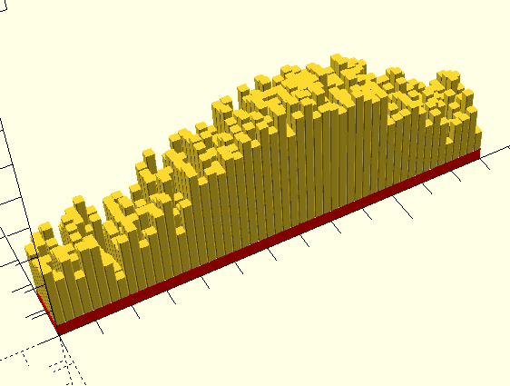
Model originally uploaded to Thingiverse at https://www.thingiverse.com/thing:4233167.
Generate a 3d model of data in a grid (great for "daily data for a year")
Personal side note
I added the two photos of the white graph after I originally posted this. The graph in those photos is particularly meaningful to me right now (March 22, 2020) as the world is living with the uncertainty of the COVID-19 ("Coronavirus") pandemic. The graph depicted in those photos shows the daily number of active (living, not recovered) COVID-19 cases in China from January 22 through March 20, 2020.
I live in the US, so why did I choose China? Because as of right now they are pretty much the only place in the world where the number of active cases is going down. This graph represents hope for the future, and the ability of humans to overcome challenges.
This script (daily-by-year-elevation-graph.scad) generates a 3d model consisting of a grid of cells (X and Y axes) The elevation (Z axis) of each cell is defined by a value in an array of data.
It also (optionally) embosses a label in the bottom of the model.
The included STL files are meant as examples of the types of graphs that can be created. They are made from the example data (data-by-year__example.scad). Those graphs represent weather data (high temperature and precipitation) for Zion National Park in Utah, USA for the years 2018 and 2019. (The OpenSCAD rendering and the red-gray-blue print show the 2018 daily high temperature data.)
How to use:-
Save a copy of the file data-by-year__example.scad with the name data-by-year.scad. This file is where you can put the data for your chart. (Alternatively you can name the file whatever you want and just change the include statement in the code.)
-
Open the file daily-by-year-elevation-graph.scad using OpenSCAD
-
Run the script to see a chart. By default the data is organized into a grid (from the top-down view) somewhat like a GitHub contribution graph. Each "column" (y-axis) is a week, with days running down from Sunday to Saturday.
However, the code doesn't require a fixed number of values or specific grid dimensions. By changing some of the variables you can use it to show (for example) days, hours, or even values where the x- and y-axis don't represent time at all.
-
You can change the data in data-by-year.scad. The format is documented there. You can also configure several parameters in daily-by-year-elevation-graph.scad, to change (among other things) the dimensions of the grid, the scale, etc.
Note that this code was developed using OpenSCAD version 2018.10.13.ci145, and it uses some apis that are not available in earlier versions.
The "primary" home of this code is on GitHub: https://github.com/probertson/daily-by-year-elevation-graph
If you make improvements, please submit the changes as a Pull Request there.


